Dashboard improvements
Synchronized cursor hover
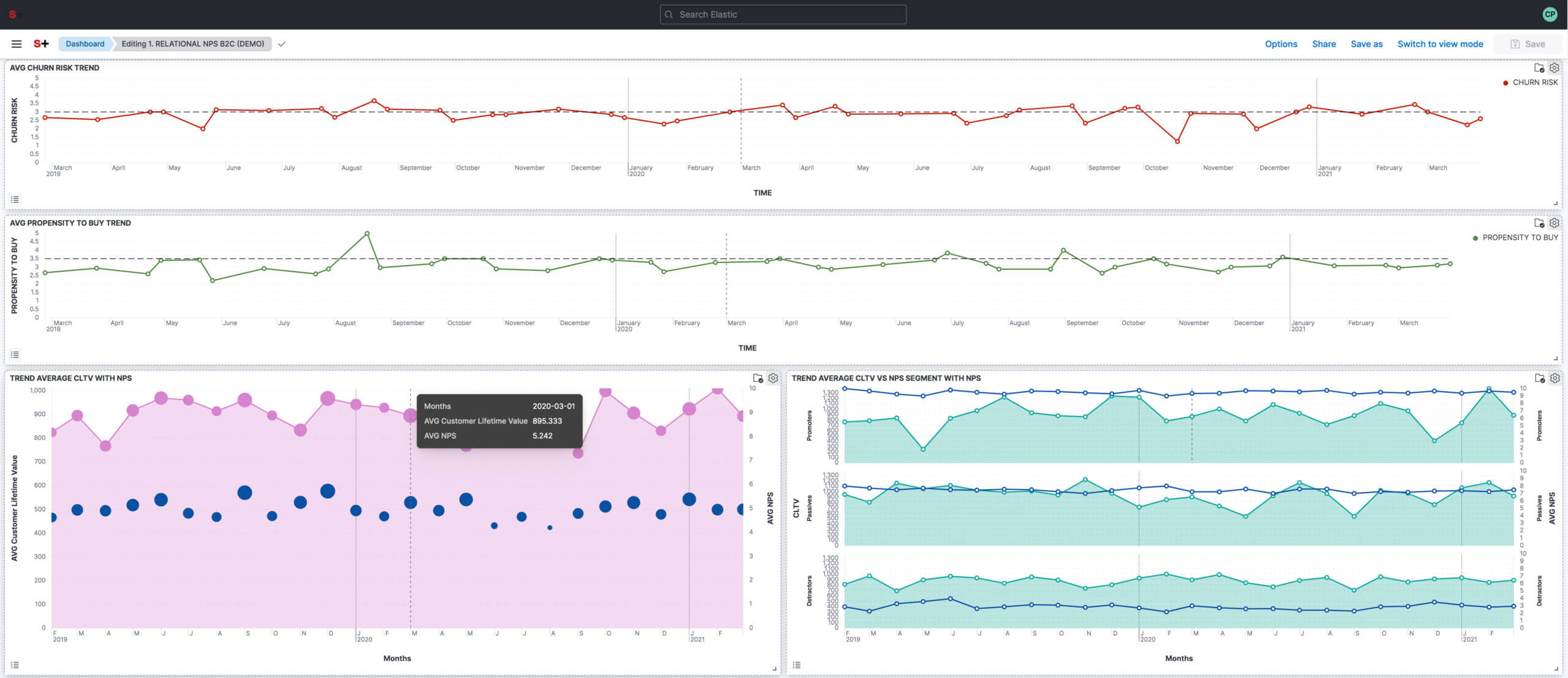
The data visualization capability is improved even more by synchronizing your cursor position with the visualization panels you create— a feature that lets you move seamlessly from looking at data to seeing it in context.
When your dashboard contains time series panels, hovering on one panel also hovers on the same time period as the other panels, regardless of the index pattern.
When your dashboard contains non-time series panels, hovering on one value now highlights the same value on the other panels, as long as the data is from the same index pattern.
Visualization improvements
Horizontal and vertical gauges
Don’t waste your time with boring line charts. Use gauge visualizations and add extra context to your metrics!
Show minimum and maximum values dynamically by using a quick function or custom formula
Set a static value for known metric ranges
Include a goal value to see if a metric is above or below the goal
Mosaic visualization
What is the best way for visual comparisons in VOC CI? Treemaps and two-layer cakes are definitely fine, but mosaic visualization, also known as marimekko or mekko, is the best choice for side-by-side comparisons of two dimensions against a single metric.
Let’s try it!
Let’s try it!
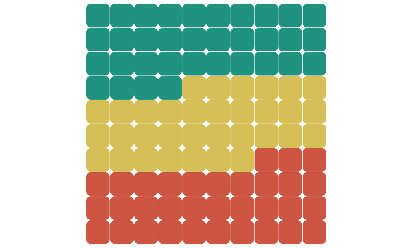
Waffle visualization
Are you familiar with waffles? No, I don’t mean breakfast food.
Waffle charts allow you to create visualizations with a similar information density as pie charts while making better use of space!
Waffles display the data in 1% blocks and are designed for square spaces, which aligns well with how most dashboards are created.
Waffles display the data in 1% blocks and are designed for square spaces, which aligns well with how most dashboards are created.
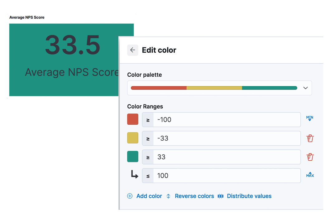
Color by value in metrics
Visualizations are more effective when color is used to convey meaning. Apply color to the text and background of metric visualizations based on the value of the metric. Set up color stops for multiple colors.
This helps to make the important pieces stand out…and also has the added benefit that it looks really cool!
This helps to make the important pieces stand out…and also has the added benefit that it looks really cool!
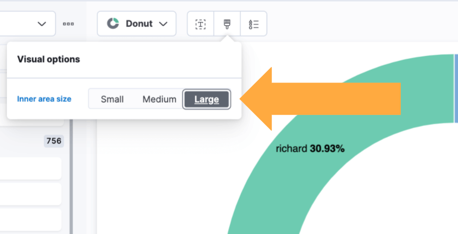
Configurable donut visualizations
Let’s customize it if desired.
The new release allow you to configure the inner area size (or donut hole) in the donut visualization. The inner area is a smaller size by default to maximize space for labels.
The new release allow you to configure the inner area size (or donut hole) in the donut visualization. The inner area is a smaller size by default to maximize space for labels.
LENS enhancements
References lines
With reference lines, you can identify specific values in your visualizations with icons, colors, and other display options.
You can:
Track metrics against goals, warning zones, and more.
Add display options, such as color, icons, and labels.
Apply color to the area above or below the reference line.
You can:
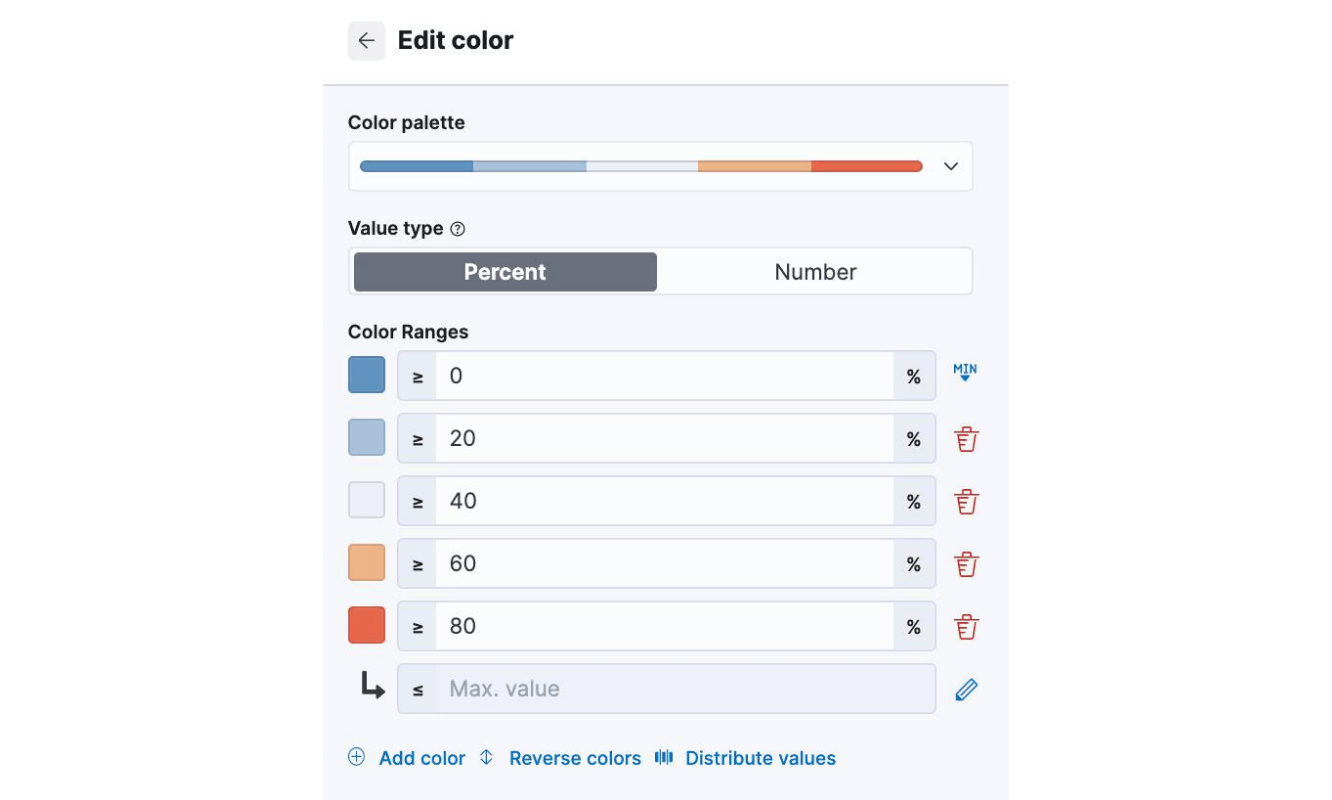
Improved color controls
With the improved color stop editing experience, you can quickly add color stops that fall outside of your defined ranges (above or below the minimum and maximum).
These revised controls also add the ability to evenly distribute color stops in one click in Lens tables, heatmaps, metrics, and gauges.
These revised controls also add the ability to evenly distribute color stops in one click in Lens tables, heatmaps, metrics, and gauges.
Discover improvements:
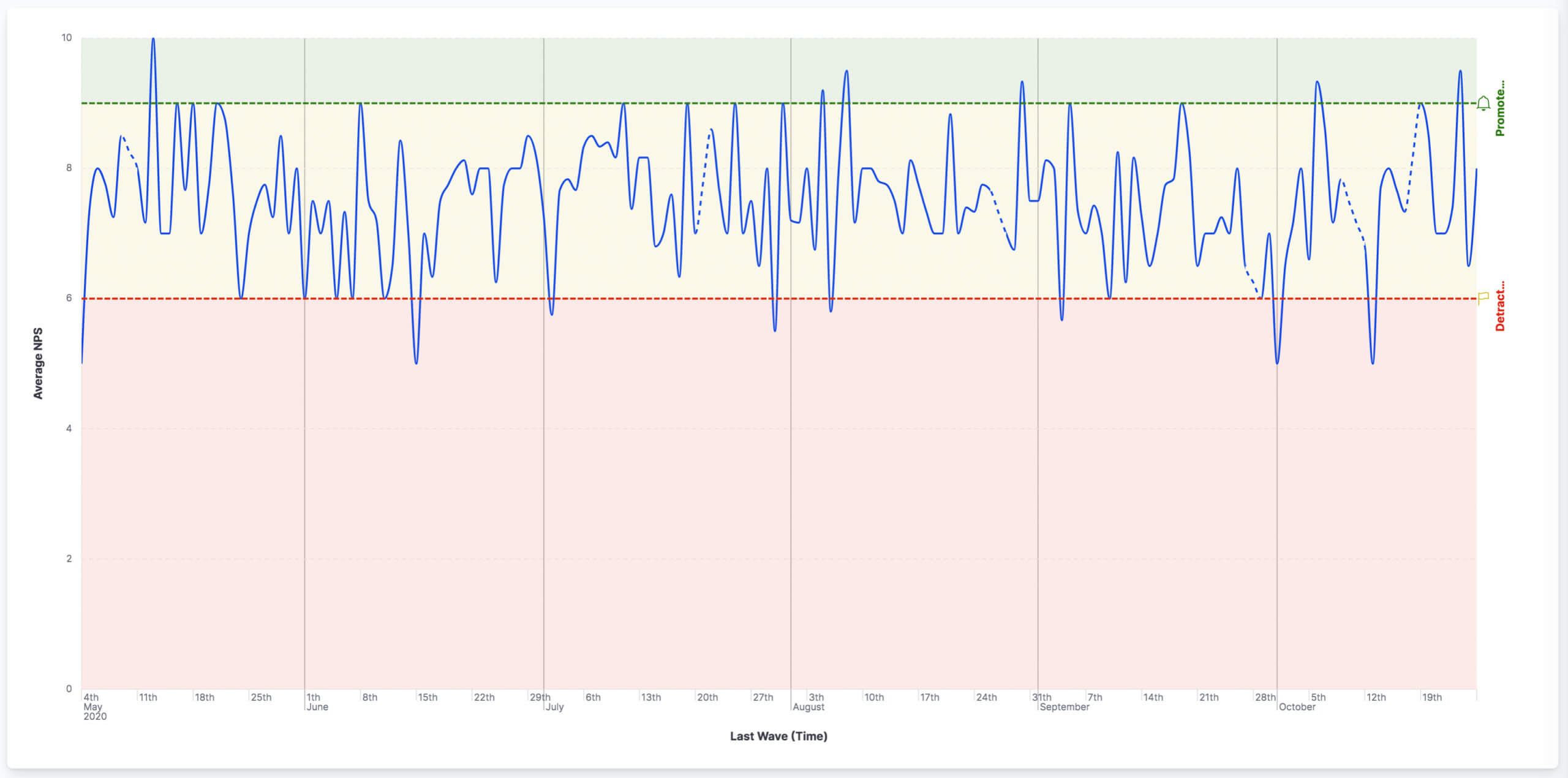
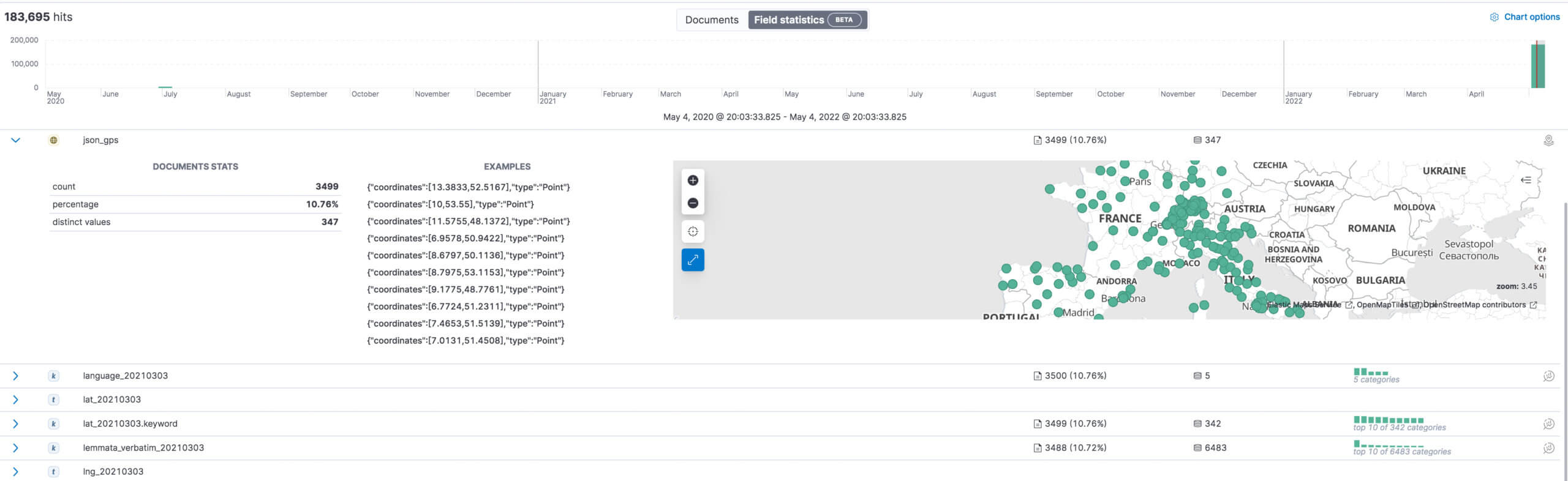
Field statistics
What is the distribution of NPS votes? The average? The minimum and maximum? What is the distribution of NPS segments?
Visualize and learn more about the shape of your data with Field statistics. Explore the fields in your data with the Field statistics view in Discover and without creating any chart.
Visualize and learn more about the shape of your data with Field statistics. Explore the fields in your data with the Field statistics view in Discover and without creating any chart.
NLP with pre-trained models
PyTorch machine learning models
The ability to upload PyTorch models to provide modern Natural Language Processing (NLP) has been added. VOC CI can integrate one of the most popular formats for building NLP models into the database, which means that pre-trained models from the popular “HuggingFace” library can be used in conjunction with other NLP operations.
The following NLP operations can be performed :Fill mask
Name Entity Recognition
Language identification
Text-classification (eg. Sentiment Analysis)
Zero-shot classification
What’s next? This feature is at the beginning of its full power and more developments are in progress in this environment.
The following NLP operations can be performed :

See the VOC CI module in action
No frills. No frills. Just a live demo of the sandsiv+ advanced visualization tool.